Turn Photos into Action
- Start Lighting the Way
Role
UX/UI Designer
Tool
Figma
Perplexity AI
ChatGPT
Whisk AI
Deliverables
Branding, Persona, Design System, Task Flow, Site Map, User Journey Map, Sketches, Wireframing, Prototyping, A/B Testing


The
Challenge
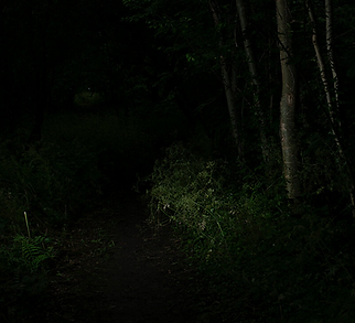
While jogging, I encountered a path that was too dimly lit to safely use, even though I had taken it before during daylight. Disappointed, I chose a different route. This experience inspired the idea for Aurolux: an app that functions as a flashlight and allows users to directly request lighting improvements from Toronto Hydro for poorly lit areas.


Losing sight of other runners,
getting on wrong side of the road
Having to take a detour, using another unfamiliar or new route
Changing speed to “too fast” or “too slow” due to the darkness


Problem with Potential solution: Toronto Hydro App
❌ No option to report a light improvement issue in public area. (only electrical emergencies such as downed lines)
❌ No direct option to report an light improvement issue.


Aurolux: How it works


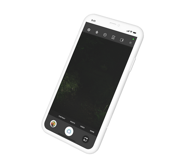
Discover the dim area, open the app.


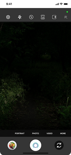
In Aurolux mode, capture dim area by tapping Aurolux button.
Confirm to send light improvement request.


Persona: Andy Park

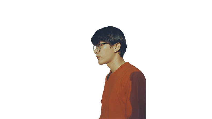
26-year old ux designer who is interested in running, health and community. He is interested in ways that allow people to express solidarity and connection during events. Likes connecting with those of similar interests and helping people come together. Feels great satisfaction when supporting society. Uncomfortable going through dim paths. Getting lost while walking or jogging. Having to change jogging pace due to darkness. Andy uses Google Maps, Instagram, Samsung Health frequently throughout his day.


Typography & Colours
The use of the Inter and Roboto fonts in this case study is driven by their modern appearance, high readability to provide comfortable, frictionless reading experience. The colour palette resembles atmosphere of aurora also known as northern lights covering the entire sky. It synergizes with Aurolux’s vision of distributing light source in every corner, all around.


Site Map
User Accessibility: Ensure all navigation parts are intuitive and accessible, allowing users to easily find essential features like Aurolux mode, How it works. Ease of Use: Quick onboarding and “How it works” accessible directly from Home. Status Integration: Users can see the status of own requests and other requests.

Skeleton Sketch
The unique final layouts focused on clear structure,
intuitive navigation, effective function placement to enhance the overall user experience

User Journey Map

Wireframe Concepts

Design Improvements
❌ No option to skip onboarding
❌ Users may be experienced on using similar app
❌ Users may want to explore and learn independantly
✅ “Skip to login” button was added below “Continue”

Old

New
❌ No confirmation screen
❌ Users may be confused whether the action was performed
✅ Portrays sense of accomplishment
✅ Illustration amplifies emotional appeal of joy
✅ “Yes” doesn’t seem to fully solidify the confirmation, “Cancel” may refer to cancellation of the whole process

Old

New
Final Design


Patch Notes (App updates)
Shine your impact—share your results with others.
My Aurolux* tab was added to Current Status Page.
My Aurolux: Dedicated Inventory of user’s personal Aurolux records.
Sharing available in either photo view/map view.

Current Status: My Aurolux

Current Status: My Aurolux: Share


User shares reported light improvement spots.


User shares successfully installed light improvement spots.